Content slider plugin
The content slider plugin is a variation of the Text plugin, that allows you to place multiple panels (smaller Text plugins) in order, which can animate one after the other.
Demo mode
Edit mode
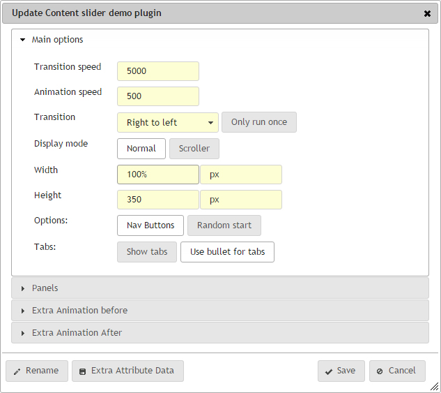
The editing options are split into 4 sections, although essentially there are 3, with the last two being fairly similar, with the minor difference being that one starts before the panel transition, and the other happens afterwards.
Main options

Transition speed
This is the time that each panel is displayed for, before the next panel is shown. The time here is set in milliseconds, so the default value of 5000 is the equivalent of 5 seconds.
If you leave this field blank, then no animation will take place. You can toggle the Nav buttons or the tabs to allow your visitors to navigate through any other panels.
Animation speed
This is the time is takes for the chosen animation to execute. So the time between the start of the first panel being shown, and the completion of the next panel being shown. Again this is in milliseconds, so the default value is set for 500, which is half a second.
Transition
This is the type of animation that takes place when going from one panel to the other. The first four options (Right to left, Left to right, Top to bottom and Bottom to top) are all slide transitions, they just detail the direction of the slide.
Then there is the simple Fade in and out between panels,followed by a Box roll, which is a more advanced animation, and may require some template tinkering to get the full effect working without any issues. Feel free to contact us should you which to see this in action, or have this added to your site.
Only run once
Toggling this option, means that the animation only runs through every panel once, and then stops on the last panel. If this is left unchecked, then the animation continues to loop round continuously.
Display mode
There are two types of display mode for the slider. Normal, which means that the content slider fits the size of a panel.
The Scroller version means that the panel can be a different size. What this would allow you to do is display more than one panel at the same time. So for example, if you set the Width to 50%, then two panels would display (see below example. and the animation from Right to left, would push one panel off the left, move the one on the right to the left and still in view, and bring in the next panel from the right and display it on the left.
WidthThis sets the width of each panel. You have two options, first the number value, and then the measurement, so px (pixels) or % (percentage).
The default is 100%, which makes it responsive.
Height
This sets the height of each panel. You have two options, first the number value, and then the measurement, so px (pixels) or % (percentage).
The default is 350 px, which is a nice height for banners. You may want to check your template allows for these to be changed when the site goes responsive.
Options - Nav buttons
Toggling the Nav buttons puts left and right navigation buttons of the panel. These are styled by default, but can be customised within the template to look different. The buttons trigger the animation to either the previous or the next panel.
Options - Random start
if this is toggled, then on every page load, and panel will be selected at random to be the first panel shown. The panel sequence remains the same, so any animation, tab buttons of nav buttons will follow the order of your panels.
Tabs - Show tabs
Tabs are a series of buttons, which allow you to jump to any of the panels. There will be a tab for each panel, making it easy for you to jump from the first to the fifth panel.
Tabs are hidden by default, toggling this button will display them. They are essentially links within a list, so be styled by your template in a variety of ways.
Tabs - Use bullet for tabs
By default, we use bullet points for tabs. If these are getting in the way of your styling within your template, you can toggle these off, and the tab links will just insert a blank space instead. Some people like to use other symbols for their tabs, maybe something from FontAwesome, but these bullet points get in the way.
Panels
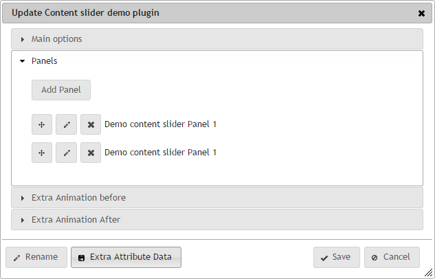
If you are editing this plugin for the first time, then there will only be a button called Add Panel. This will bring up a dialog with options to add a new panel. The options you get are the same as with editing and we go into more details below. Creating a new Panel puts the latest at the bottom of the list.

The list of panels appear below the Add panel button. The list appears vertically, and each panel contains 4 parts, 3 of those are option buttons which appear on the left hand side. These are similar to a lot of our plugins in which items are editable and moveable.

1 - Move Button
The first button allows you to grab hold of that panel and drag it above or below other panels to change the display order. You'll notice the yellow box indicating it's new position much like when moving a plugin around a page.
2 - Edit Button
Clicking on this brings up the edit panel dialog, prepopulated with the previously saved data.
3 - Delete Button
This deletes the panel and removes it from the display.
4 - Item label
This is a stripped down version of the text entered in this panel. It contains no formatting or images, and may look odd compared to the actual display, depending on the text entered.
Adding or editing a panel
The dialog that appears, looks and works very much like the Text plugin, with only one extra option.
The extra option is the text field at the top for the Background. This allows you to assign a background image to this panel, allowing each panel to have its own unique panel. The button on the right opens the File manager, allowing you to select straight from there.
If you don't require a background, and either you want it blank, or the template will take care of it, then just leave it empty.
The main text below is the main content of this panel. Use it exactly like you would with the text plugin. Enter the text you want to appear, add the styling etc. You have the option for this to be as simple or as complicated as you require.
Once you are happy with this panel, click save, and it will either add or update the panel depending on what you previously selected.
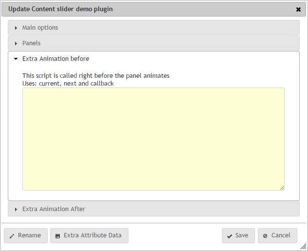
Extra animation before & Extra animation after
This is an advanced option, which allows you to enter Javascript which will be called either before the animation takes place, or after the animation has completed. The advantage of this is that you can alter the display, alter the animation, on anything else you require.

One example of where this was used, was that we animated the text and moved it around the panel once it came into view and the animation had completed. We used the before script to reset everything ready so that is was in place, ready to animate after the panel transition had completed.
You must put javascript in here, and treat it as a precreated function, which gets called by the plugin. We already allow for the fact that there may be multiple Content sliders on this page.
Valid Javascript
Make sure that your script is valid, otherwise you may break the Content slider, or worse, the page. If you do break it, check the console in the Google Inspector, or edit it via another page, and find it under the Plugins tab within the Admin panel.
